
COLLABORATIONS
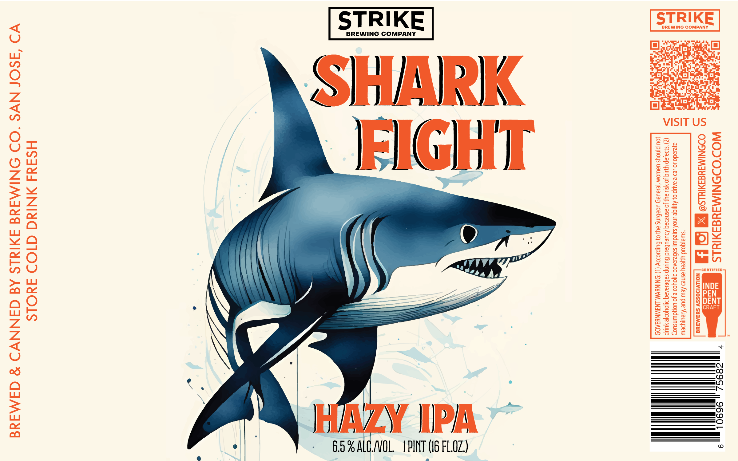
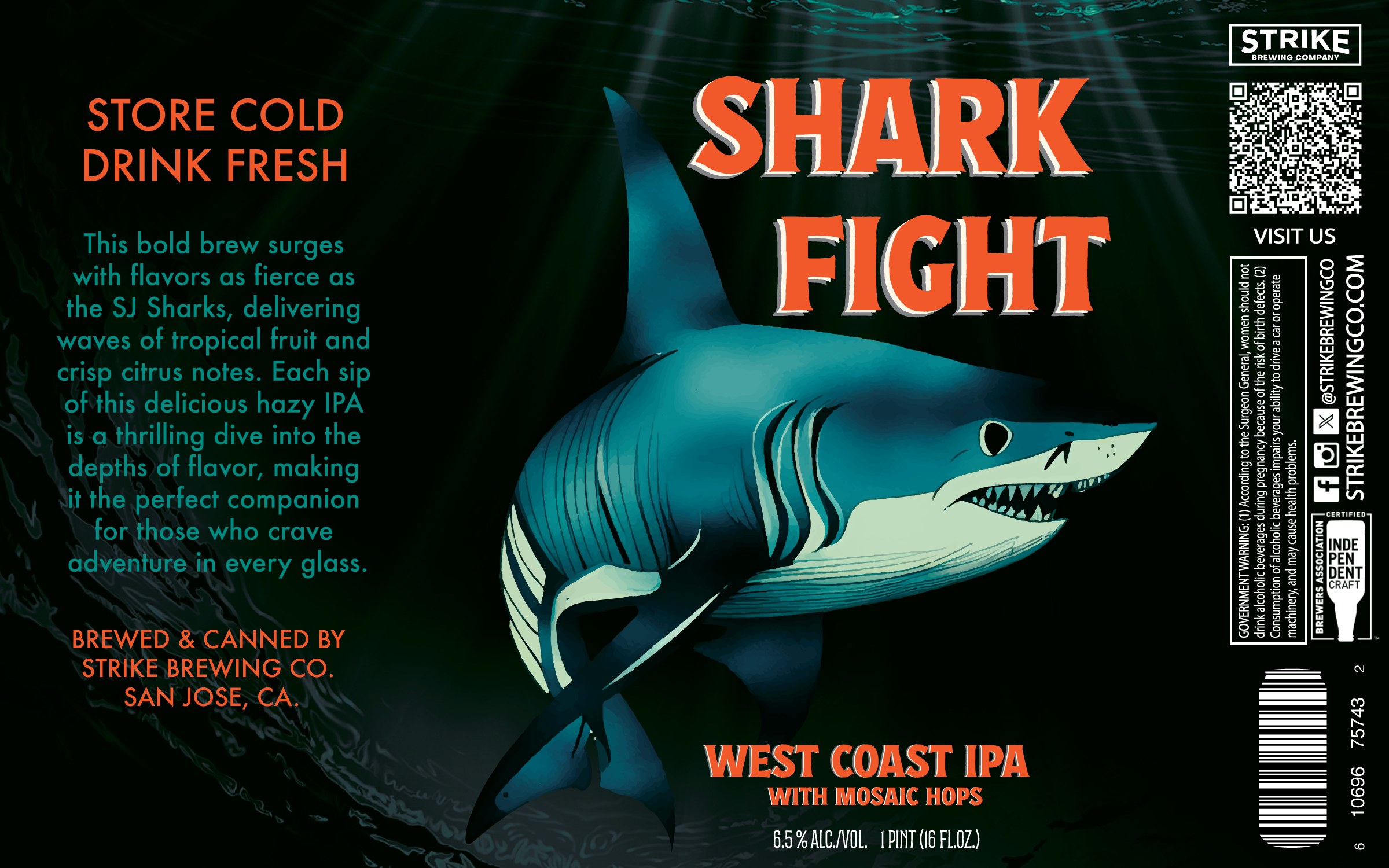
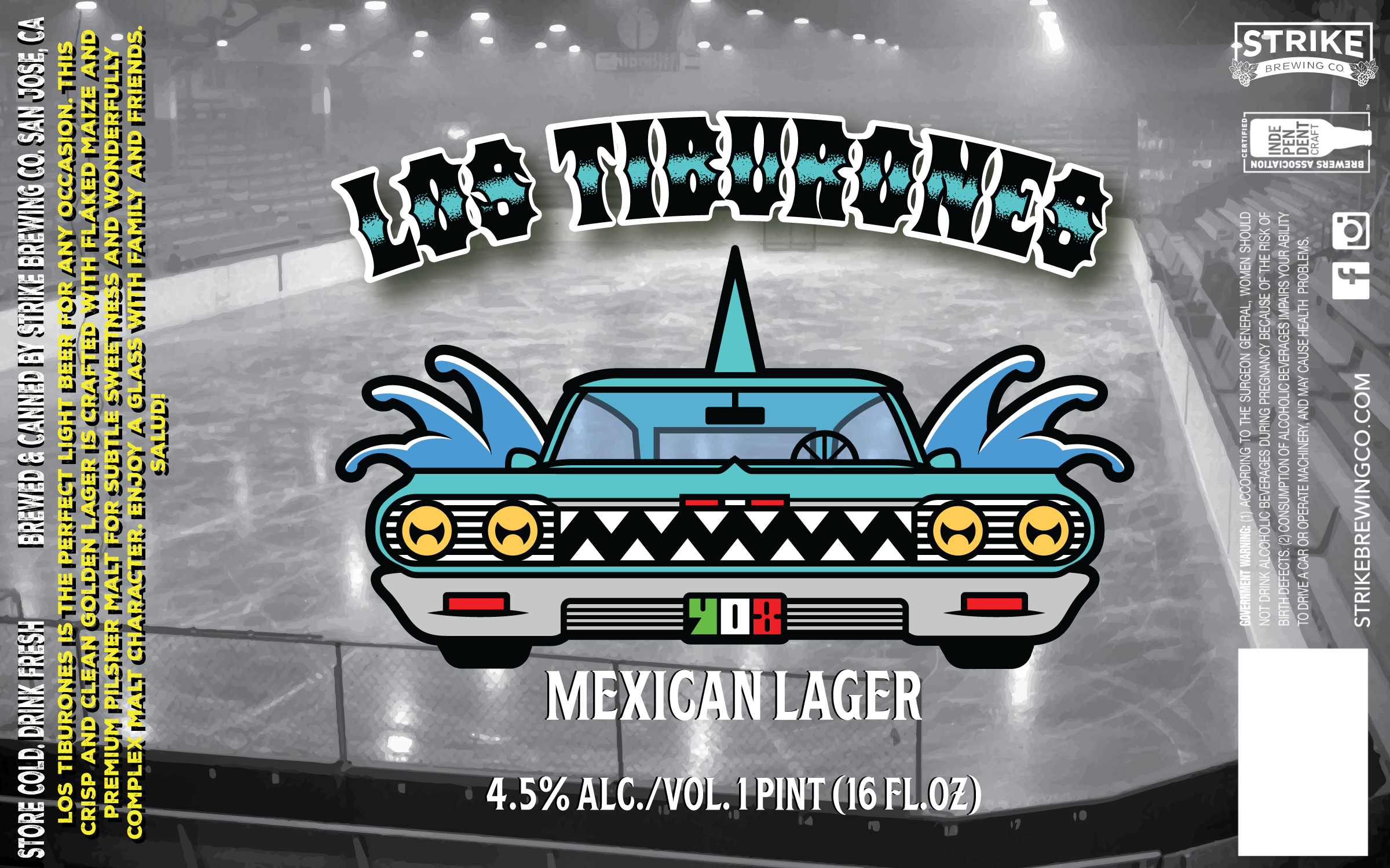
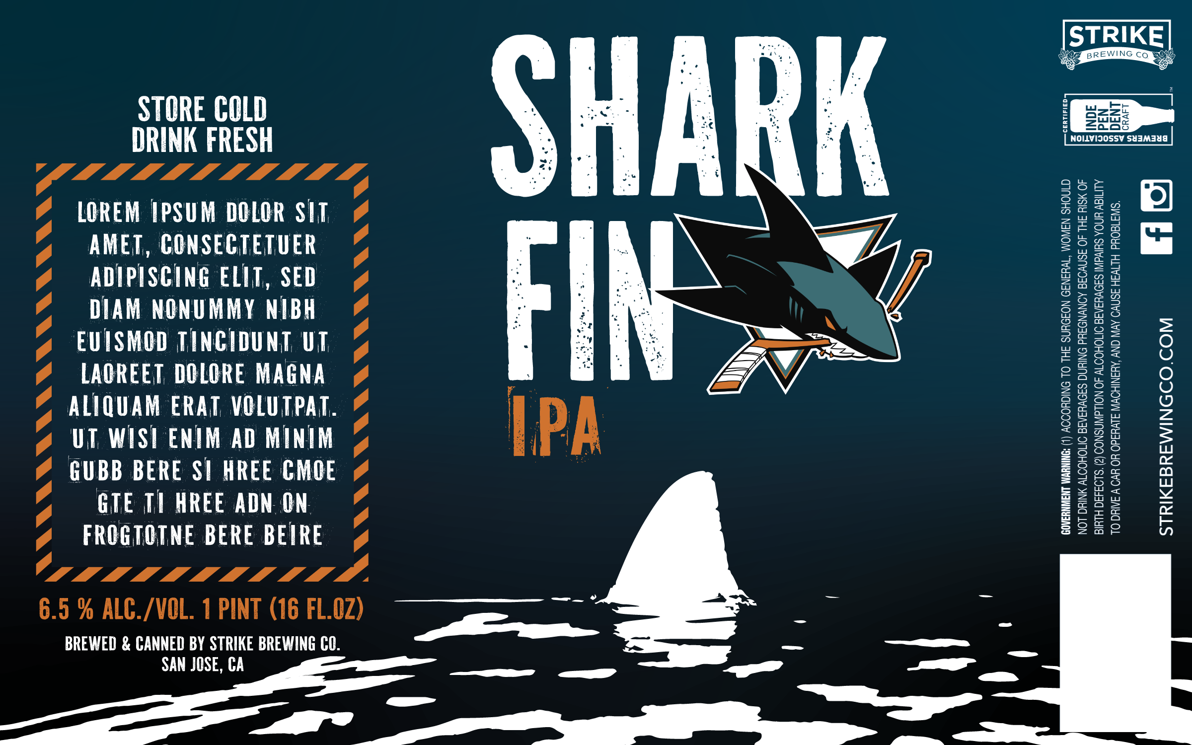
SAN JOSE SHARKS
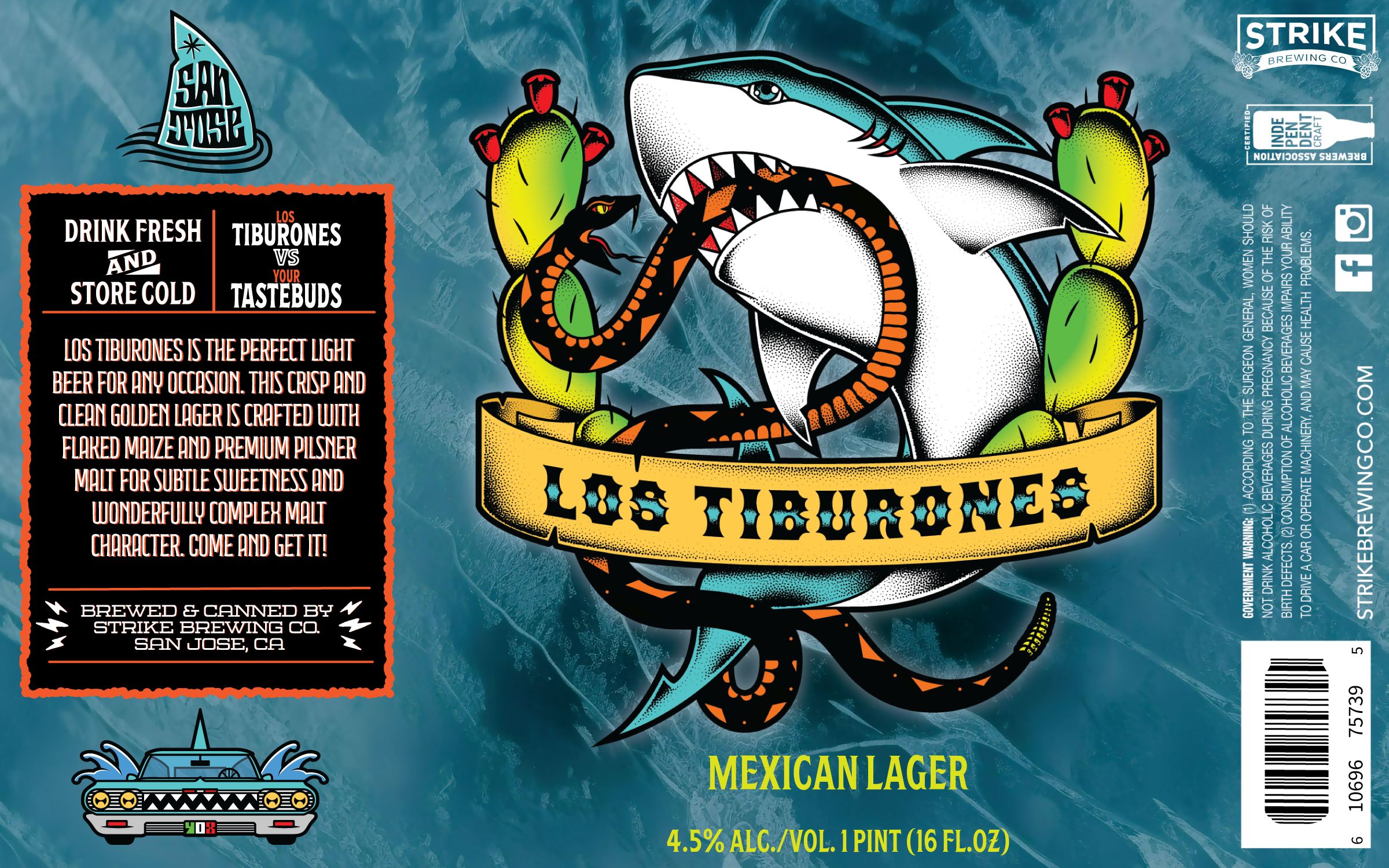
Designed a seasonal beer label for the San Jose Sharks’ 2023 season in collaboration with Strike Brewing Co. and Aramark.
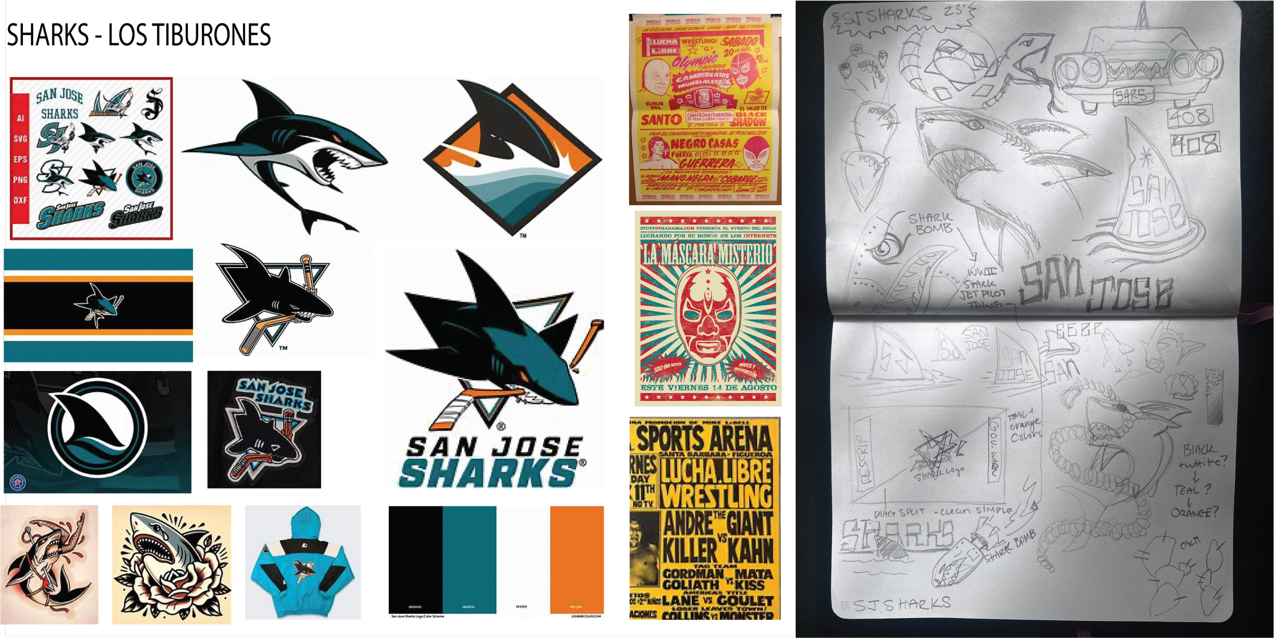
The concept was inspired by San Jose’s Chicano culture and the bold aesthetics of lucha libre posters. My goal was to blend that local identity with the Sharks’ established brand colors - teal, black, and orange - in a way that felt both authentic and exciting for fans.
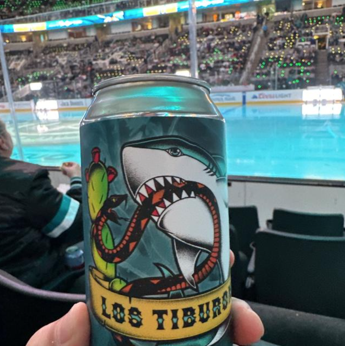
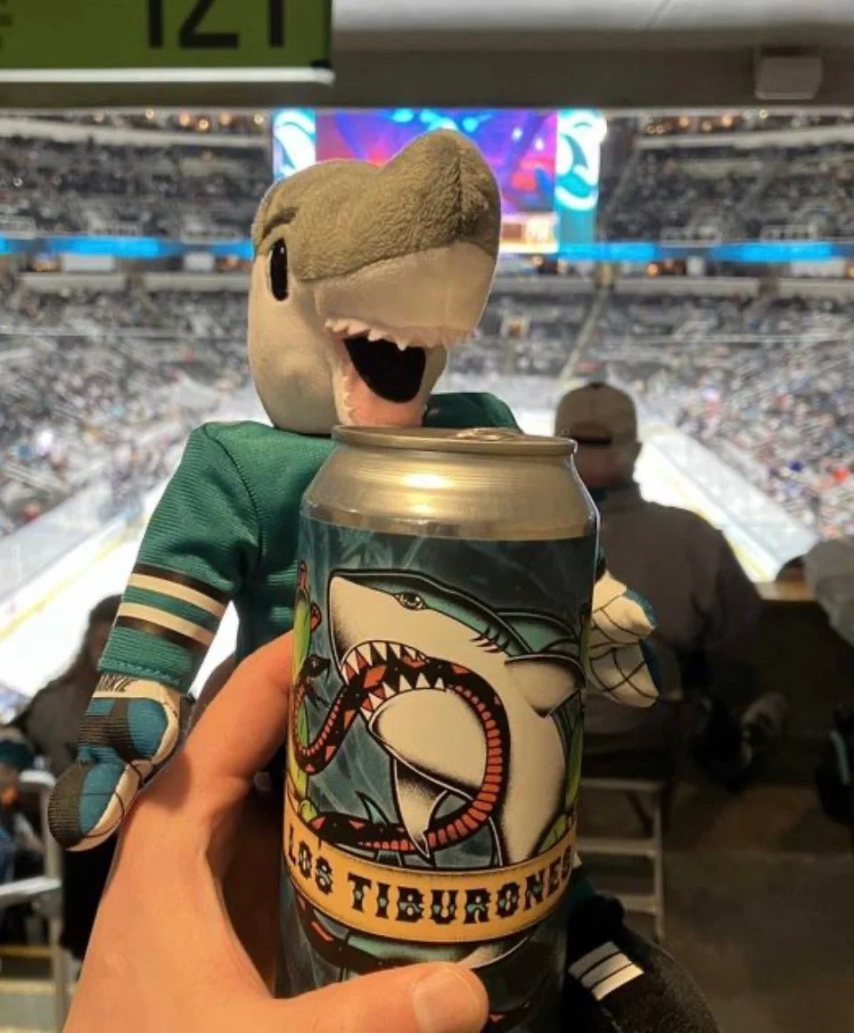
The label launched during the 2023 season and was well-received by fans. Several of my early concepts were later adapted for additional releases under the Shark Fight series, giving the collaboration an extended life beyond its initial run.
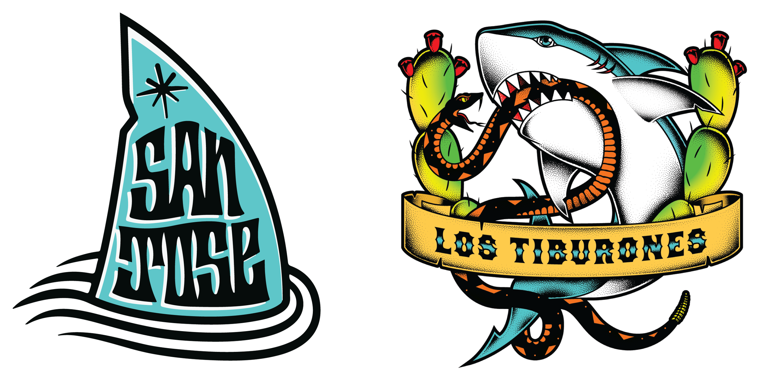
Mock-Ups
CHALLENGES:
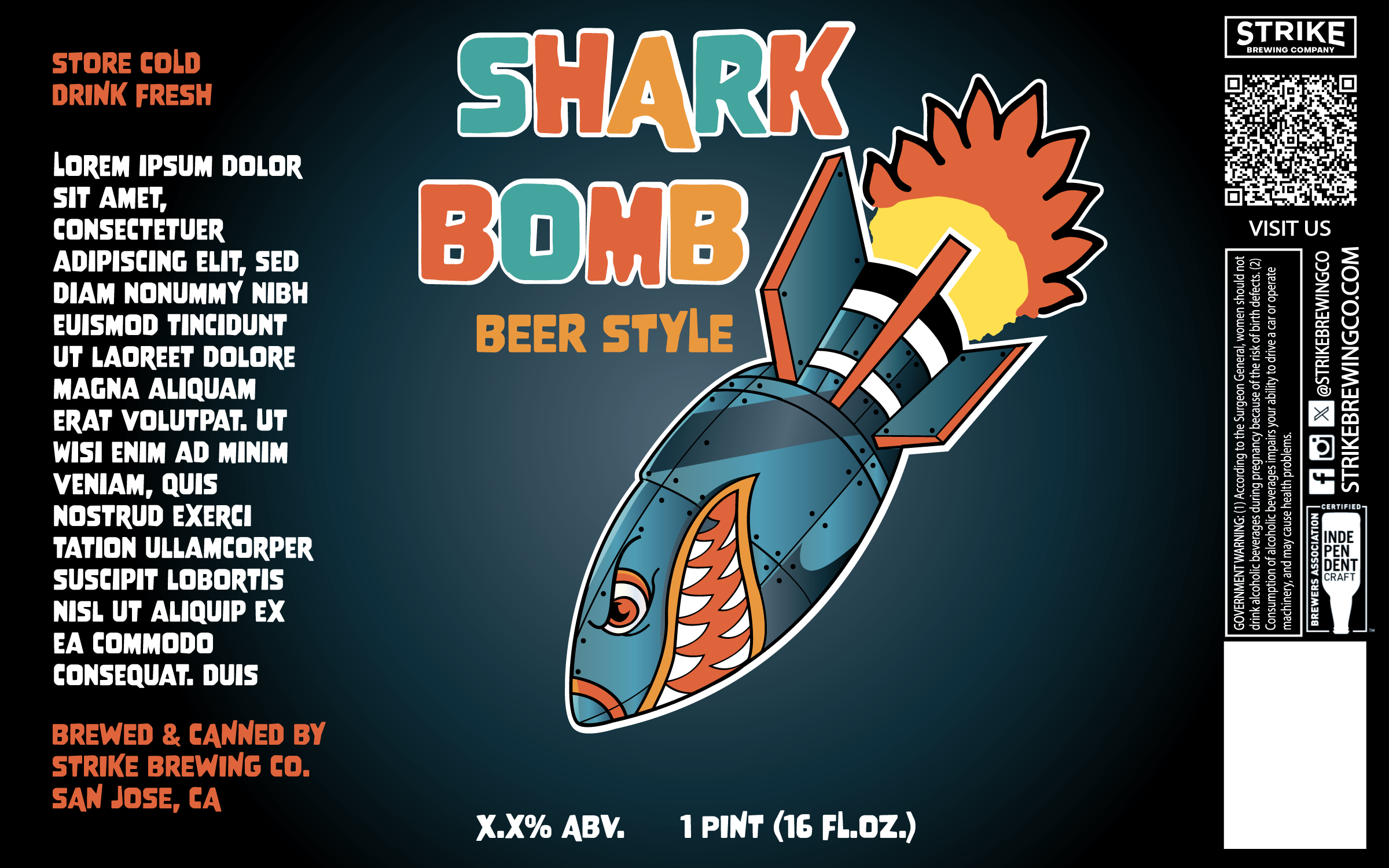
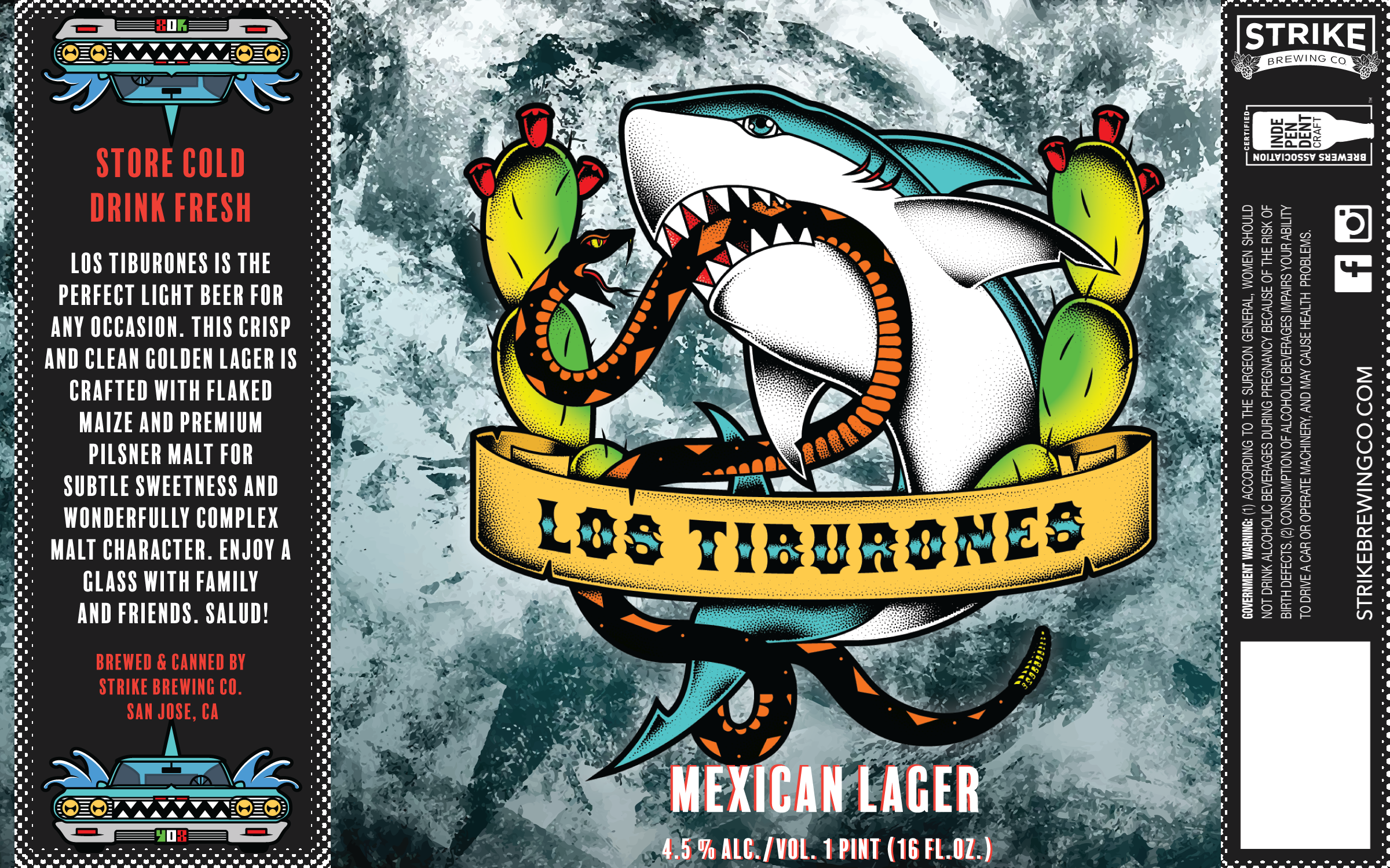
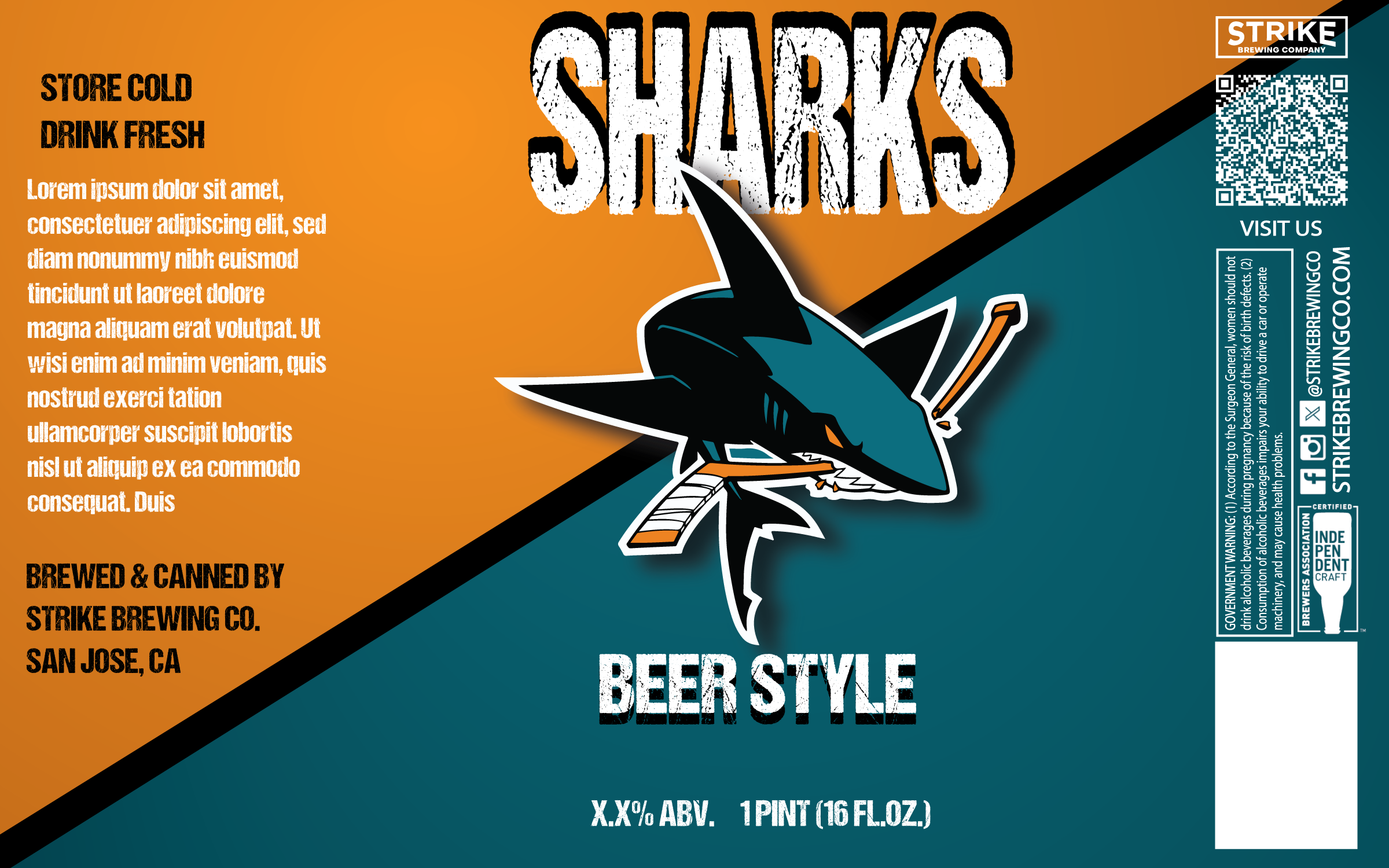
The Sharks initially had an open brief, which meant there was no clear direction for the label’s look and feel. This gave me the opportunity to explore widely and develop over ten unique concepts to help define a visual direction for the collaboration.
OUTCOME:
While the broad range of concepts sparked strong discussions, it also made choosing a final direction more complex. By combining the most successful elements from several concepts, we arrived at a cohesive label that both teams were excited about. This project reinforced the value of presenting only the strongest options to streamline client decision-making in future collaborations.
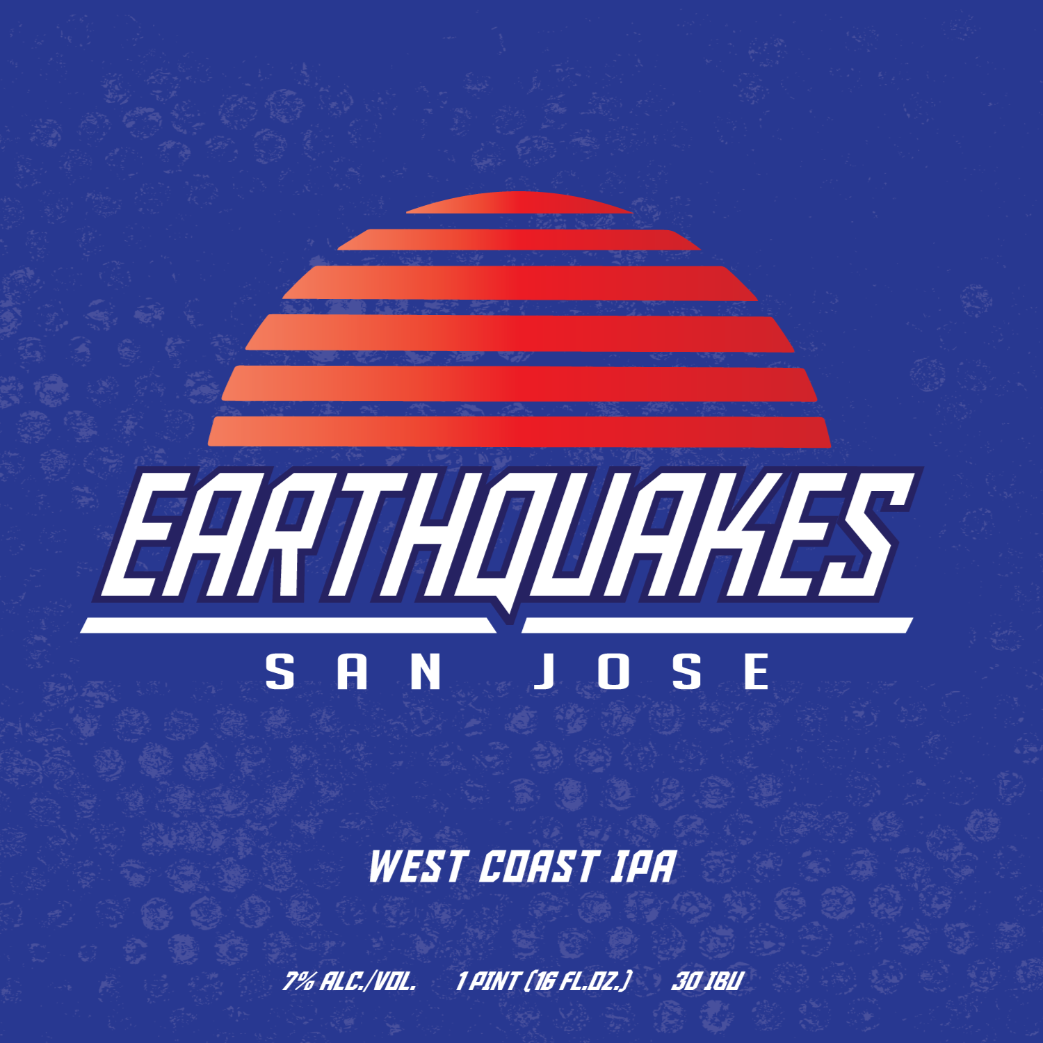
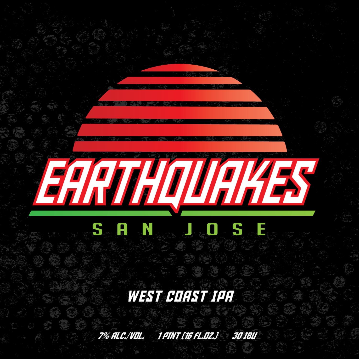
SAN JOSE EARTHQUAKES,
BAY FC, & AMERICAN OUTLAWS
This project brought together three custom beer labels created for the San Jose Earthquakes, the American Outlaws (San Jose chapter), and Bay FC, a super fun opportunity to collaborate with local teams and celebrate Bay Area soccer culture.
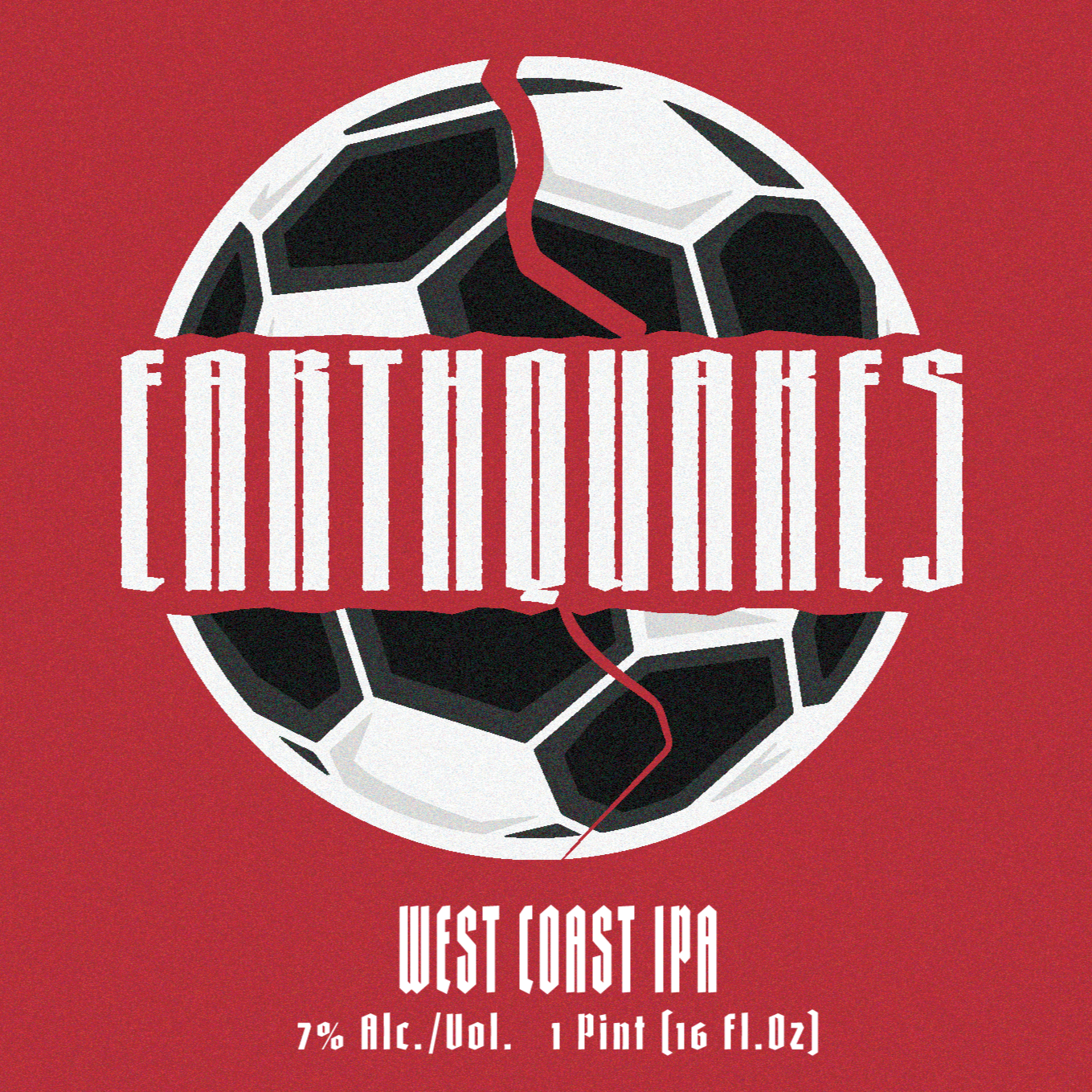
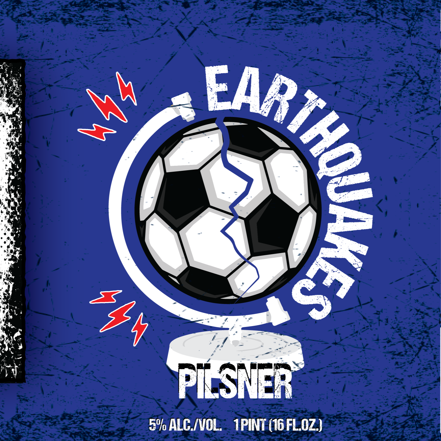
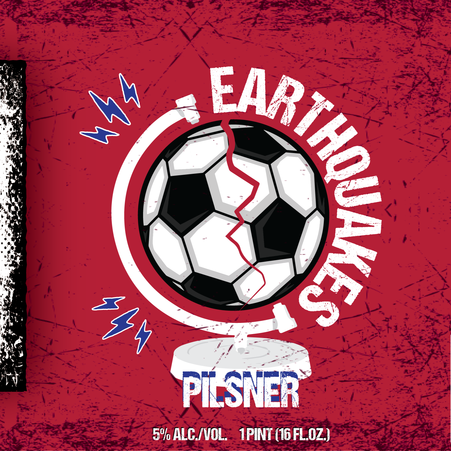
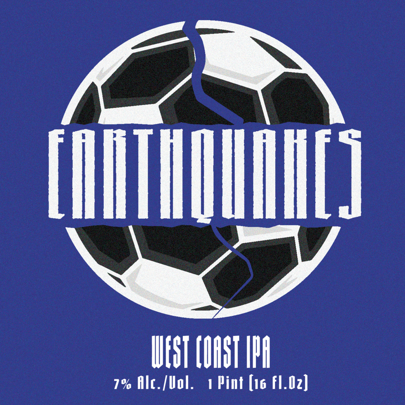
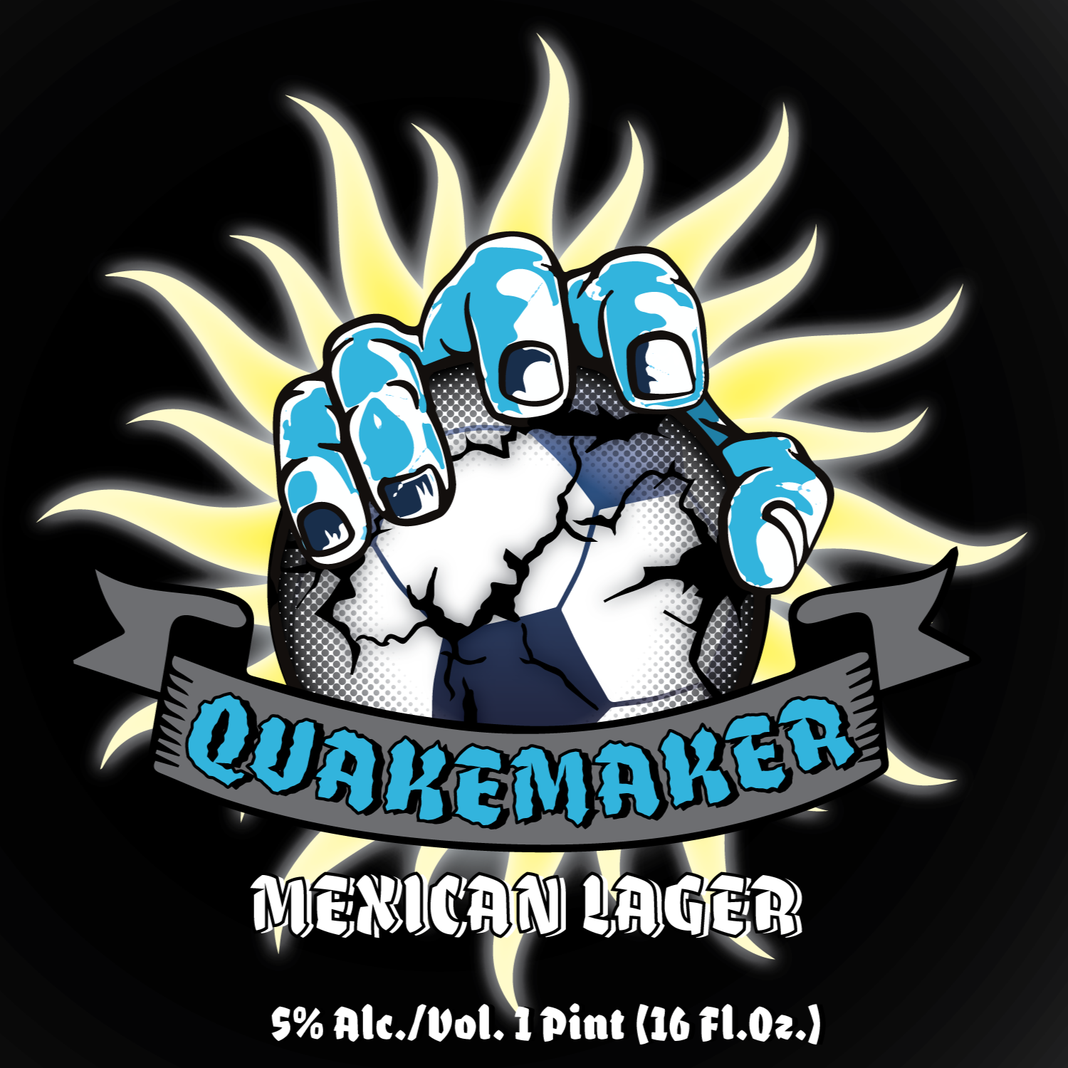
Quakes 74' IPA
I first partnered with the Earthquakes’ design team to develop Quakes 74' IPA. After exploring concepts rooted in club history, we shifted toward a modern, gritty direction inspired by their current campaigns bold, punk-influenced, and grounded in street culture. The final design captures that raw, energetic aesthetic while staying true to the Quakes brand.
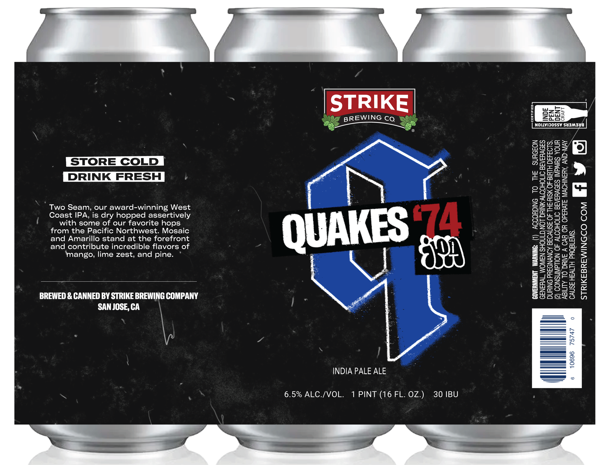
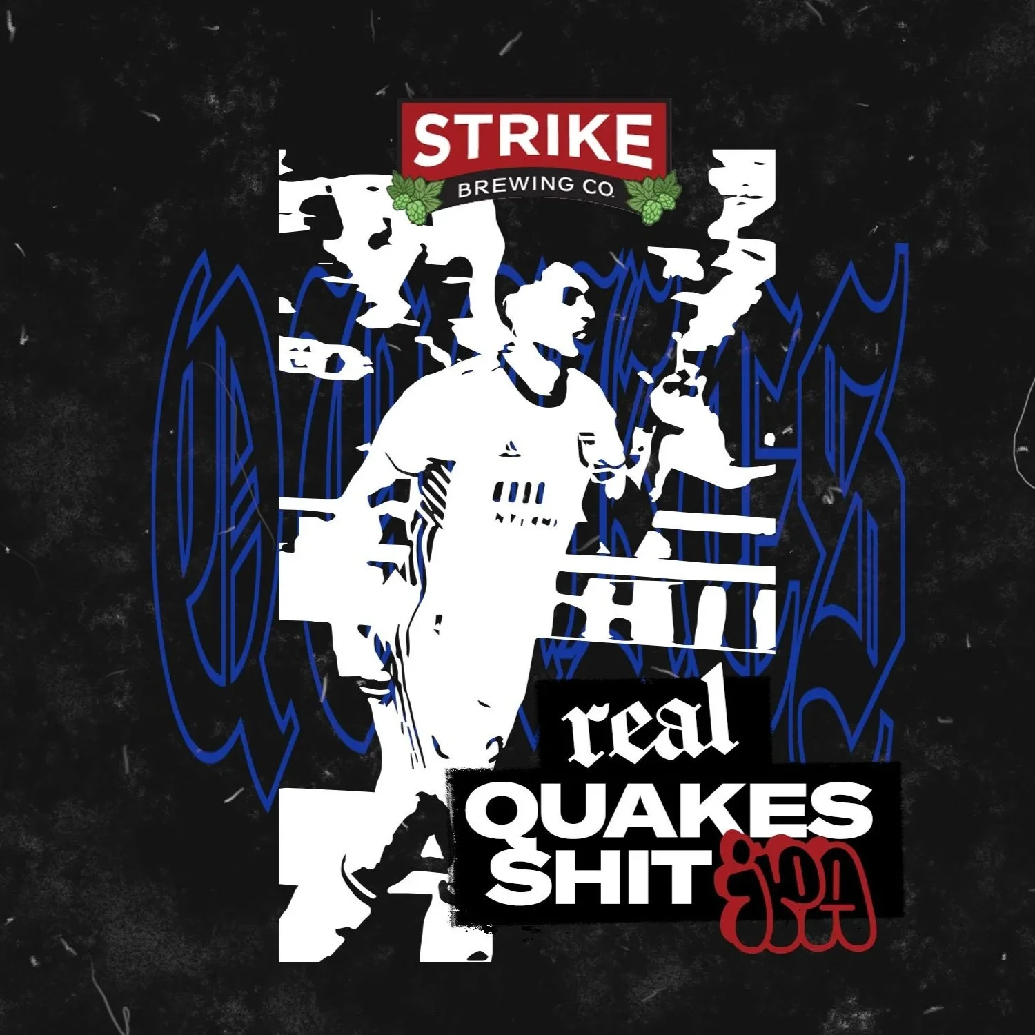
Mock-Up Runner up - No Profanity Decided upon after discussion.
MOCK-UPS

Club & Country – American Outlaws x SJ Earthquakes
I also designed Club & Country, a collaboration between the Earthquakes and the American Outlaws San Jose chapter. Their brief was simple: make it American, and keep it fútbol. The result is a clean, impactful label that blends patriotic elements with soccer culture in a straightforward, fan-focused way.
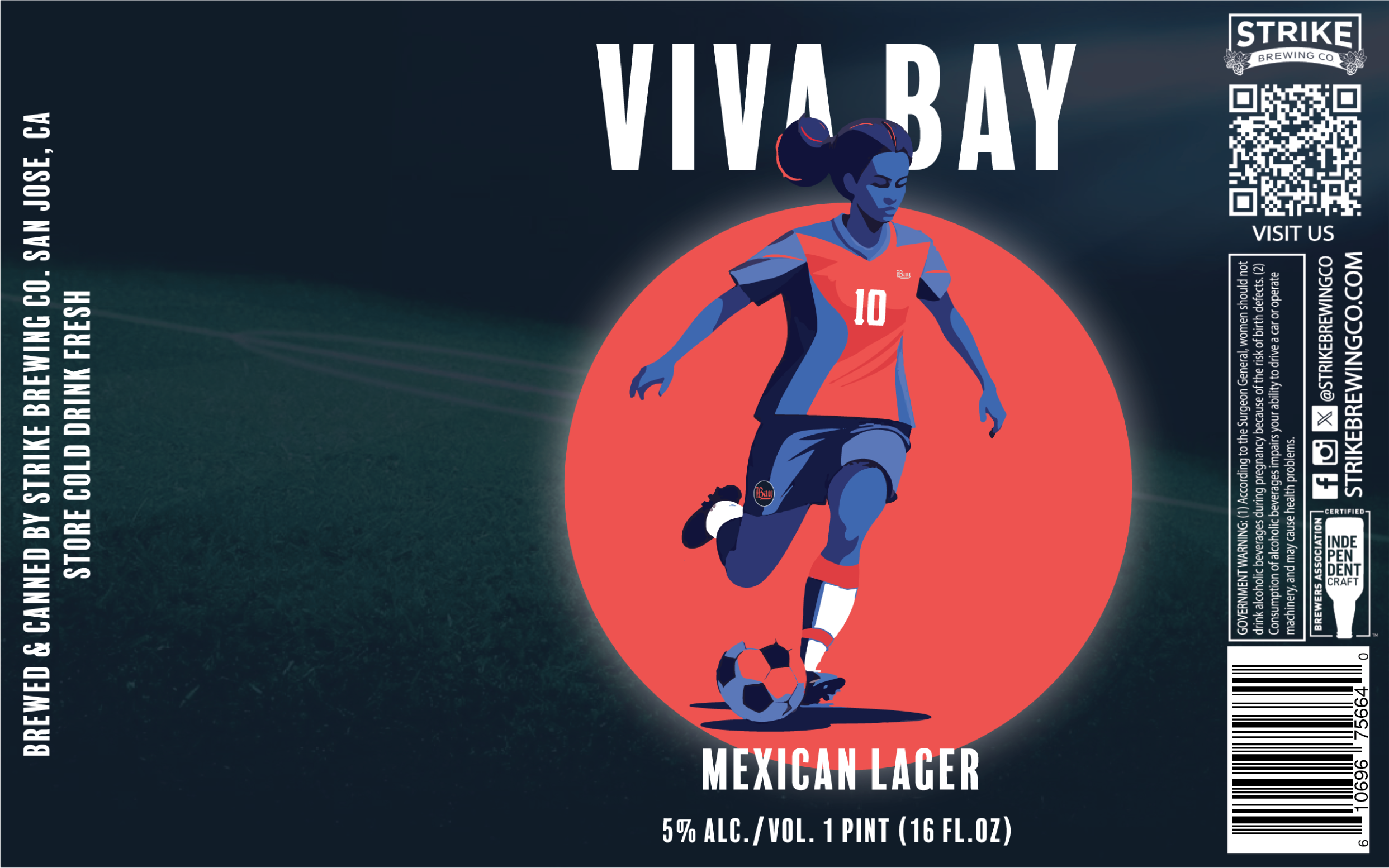
Bay FC Opening Match – VIP Release
Lastly, through connections with the Earthquakes and mutual friends involved with Bay FC, I was contracted to create a limited-edition beer label for Bay FC’s inaugural match and VIP event. This small-run release helped commemorate the launch of the Bay Area’s NWSL team with a custom design tailored specifically for their opening celebration.
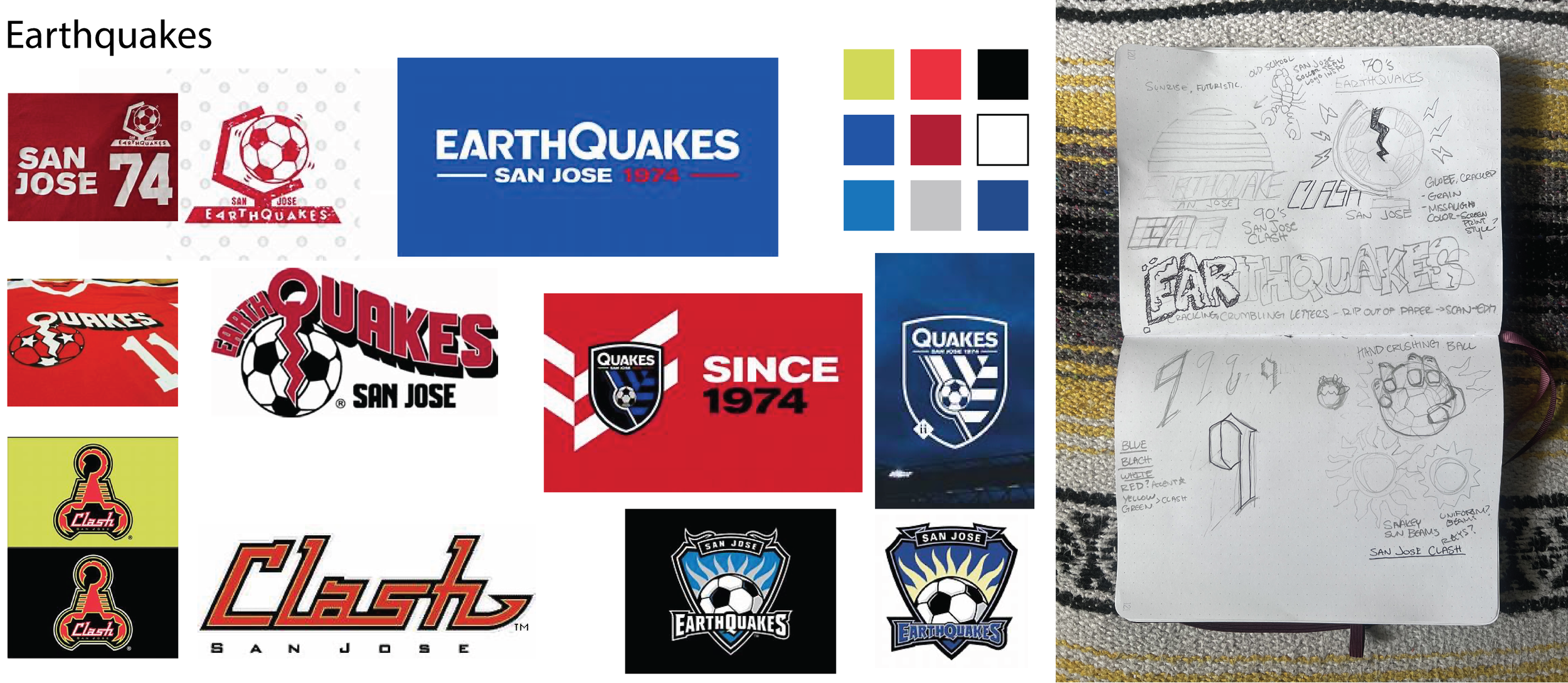
CHALLENGES: The Quakes team similar to the Sharks, did not have a clear idea in mind and it was up to me to inspire them and work from there. At first I researched the team and its history, basing some early concepts on their logos and colors of the past in a few options. This caused the same result as multiple parties liked elements from differing designs. After the secondary meeting a new vision was concepted - a more modern, rough and edgy design more in line with the modern earthquakes aesthetic and marketing style for the season.
OUTCOME: With the second round of mock-ups being done we got the go ahead on Quakes 74 IPA. After a successful launch and positive feedback, I was then asked to make two new designs for Bay FC and American Outlaws featured at games and VIP events.
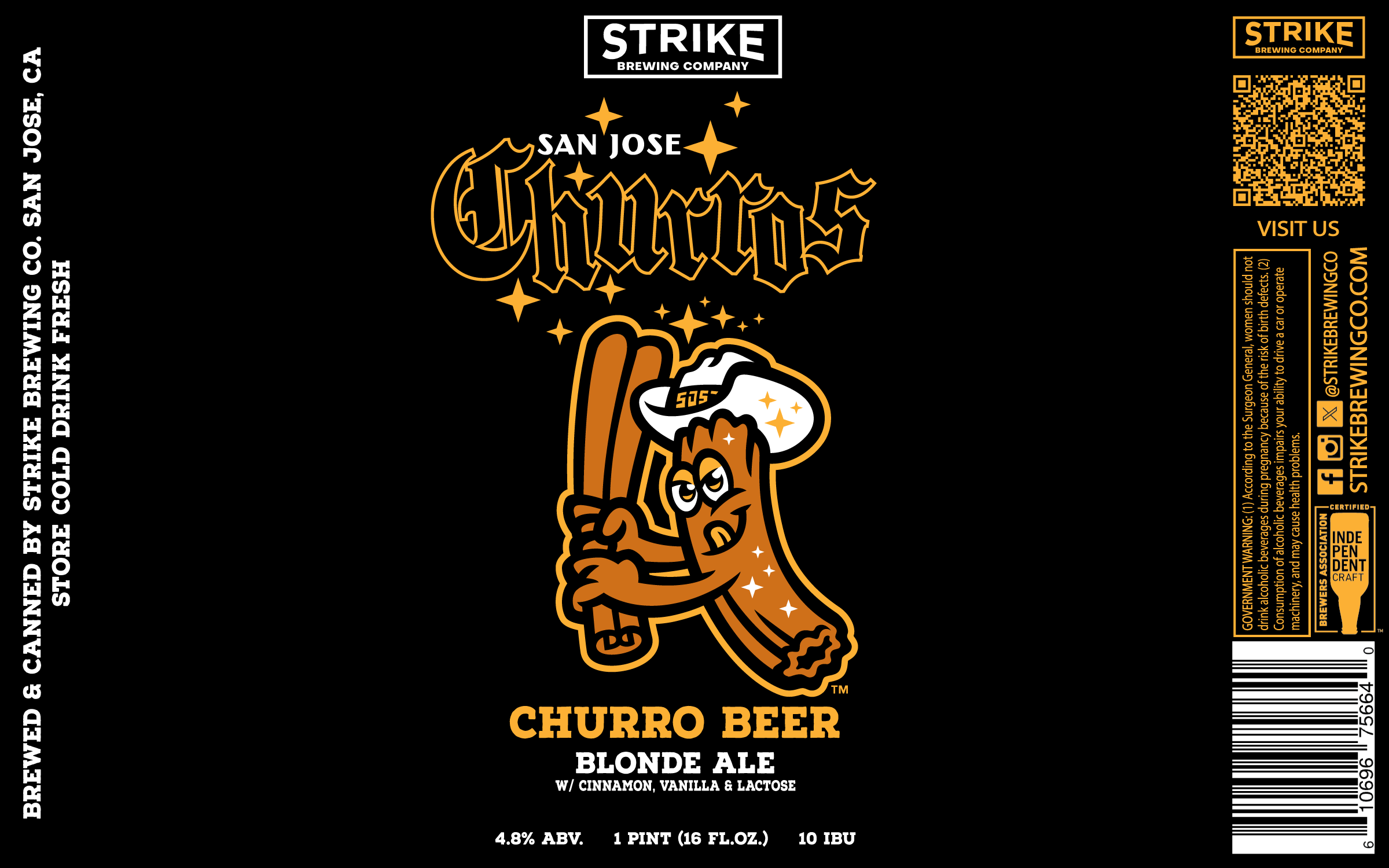
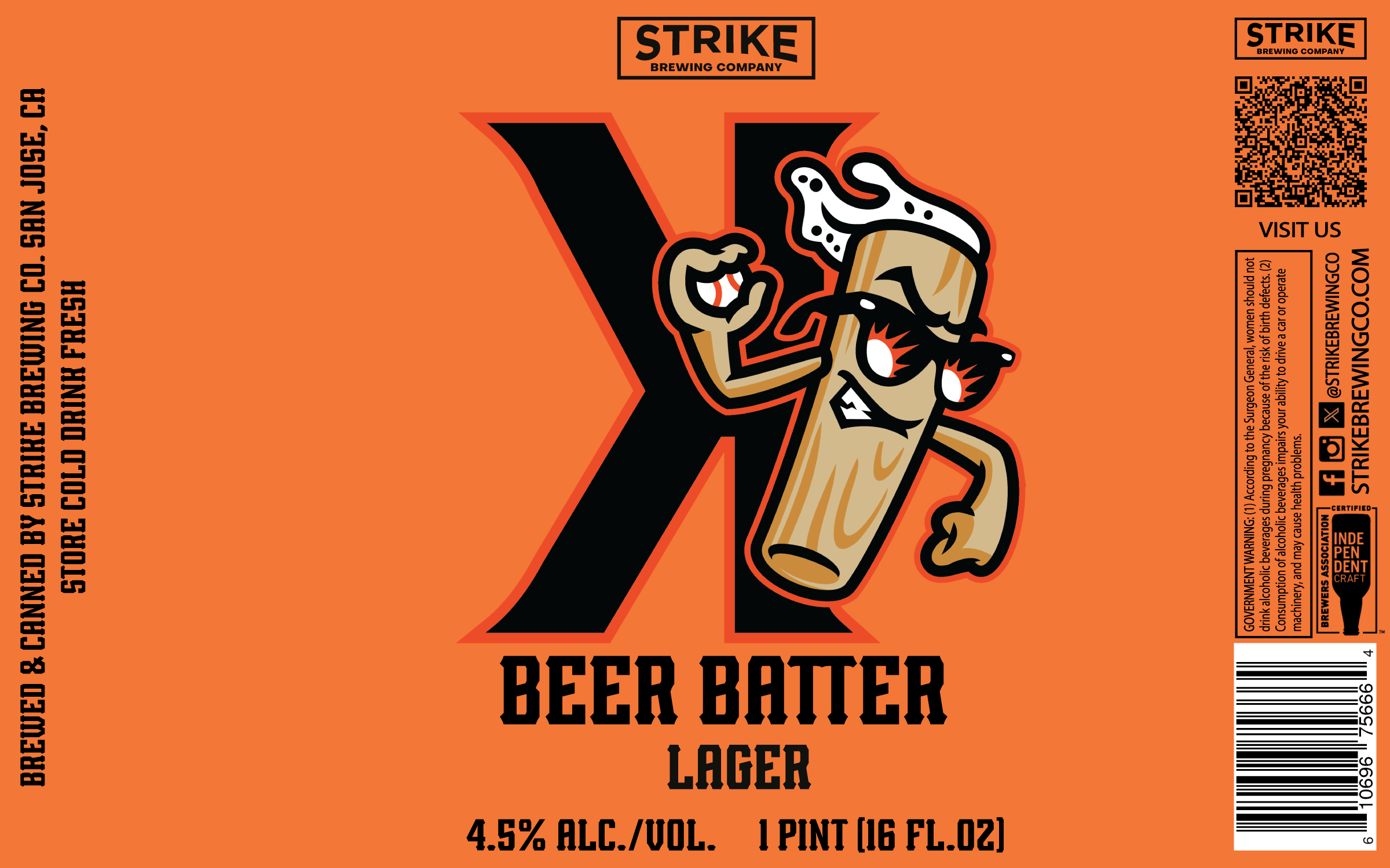
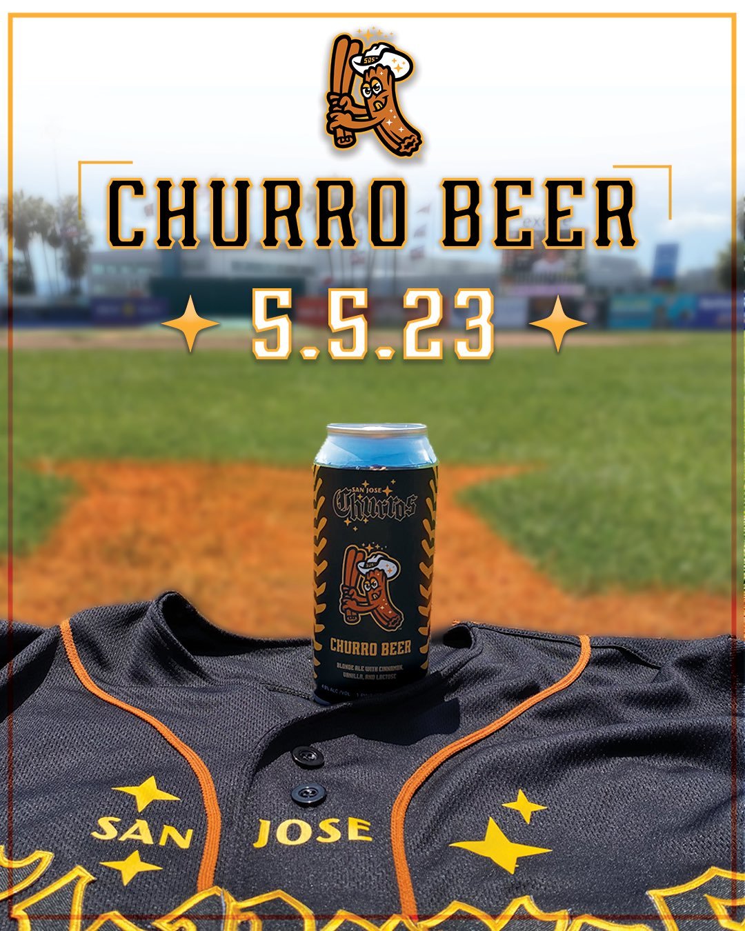
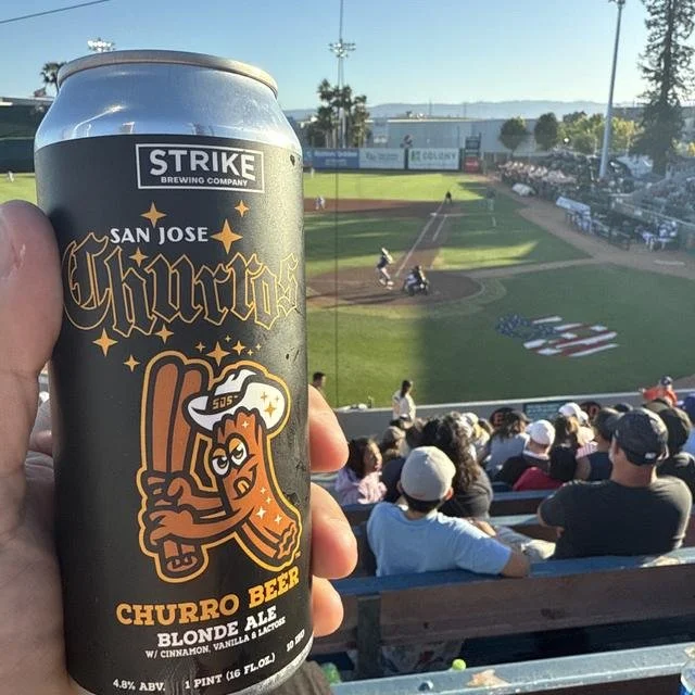
SAN JOSE GIANTS
I designed two custom beer labels for the San Jose Giants: San Jose Churros Churro Beer and Beer Batter Lager. As a regular craft beer provider to the team, I was excited to have the opportunity to translate their brand into these unique, collectible beers.
Working with the provided brand assets, I crafted two distinct labels that maintained the Giants’ identity while giving each beer its own character. The project was a fun challenge in balancing brand consistency with playful, eye-catching design.
CHALLENGES:
Create two themed beer labels using the SJ Giants’ iconic branding while maintaining Strike Brewing’s visual consistency.
OUTCOME:
Produced bold, baseball-inspired designs for Beer Batter and Churro Beer that were instantly recognizable to fans and worked seamlessly within the ballpark environment.